Every rung of the ladder: the great consistency pass 697ca69
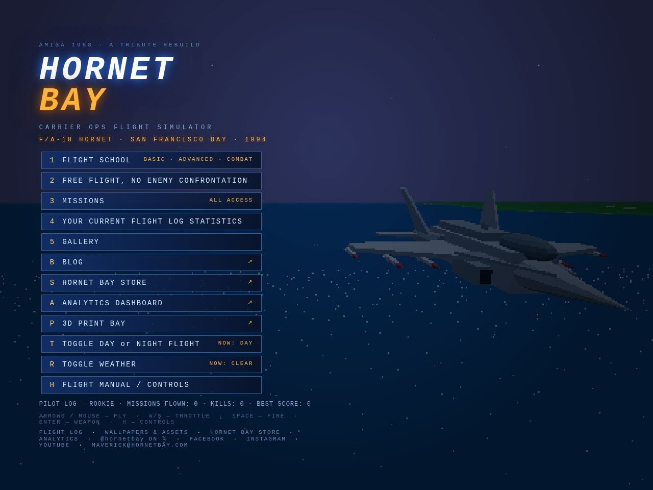
A full audit of every menu, sub-menu and page on the site — hunting for dead ends, clipped text, hidden keys and wandering navigation. Nine issues found, nine issues fixed:
In the cockpit
- ESC was dead on the free-flight map. Pick FREE FLIGHT, change your mind — and there was no way back short of reloading. ESC now steps back to the menu.
- ESC was dead on plane select. Same trap, one screen later. ESC now steps back one level: to the start-point map for free flight, to the menu for a mission (where BACK TO MISSION waits).
- The plane-select line was clipped. Five jets and the toggles on one line ran clean off both edges of the screen — you literally could not see the F-16 or the Tomcat. The bar is now a three-row panel: two rows of aircraft, then TIME / WX / ESC, every option visible.
- Every selection bar now says so: ESC — BACK rides the map select, plane select and briefing bars.
- Main-menu keys renumbered and shown. The rows were bound to 1, 2, 6, 8, 9 — with the badges hidden, so three dead keys and no way to discover the live ones. Now 1–5, sequential, and every row wears its key like the sub-menus always did.
- Mission keys every keyboard has. The board was bound F1–F16 — and F13–F16 don't exist on most keyboards, leaving four missions mouse-only. The board now runs 1–9, 0, A–F with badges shown; F1–F12 stay bound as silent aliases for anyone who learned them.
- FLIGHT MANUAL wears its H.
On the site
- One site ring on every page. Cross-links used to wander the headers — STORE · ASSETS here, STORE · ASSETS · PRINT there, nothing at all on the blog. Now all 209 pages carry the same row under the nav buttons: SQUADRON STORE · WALLPAPERS & ASSETS · 3D PRINT BAY · ANALYTICS, with the current section painted amber. It lives in the shared template, so every future page is born with it.
- Sub-headings in posts are styled — amber, letter-spaced, on-guide — instead of falling back to browser defaults.
What survived the audit unchanged: the masthead stack, the two-button nav rail, the blurb sizes, the search rail, the tag cloud and the mobile stacking — all already in formation. One look, one feel, every page.