The boards go large print: every menu, every pitch, every key in the manual, sized up to read 7f732c9
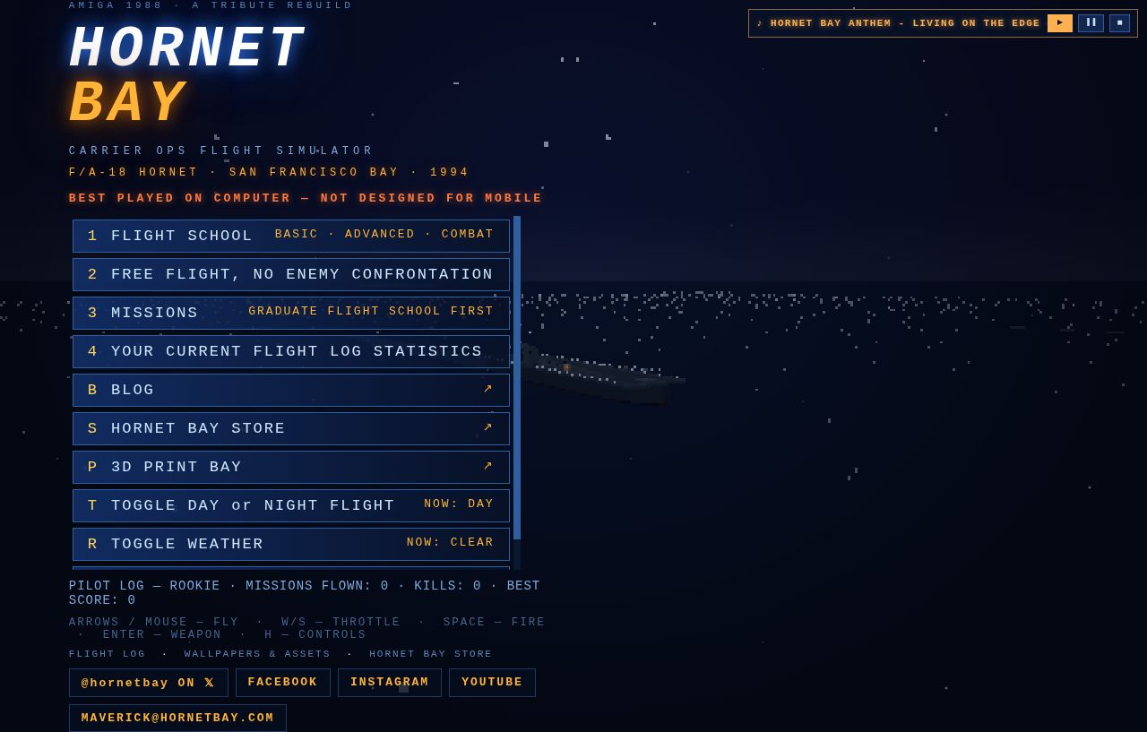
Hot on the heels of the briefing room’s large-print refit, the rest of the squadron’s paperwork follows. The main menu, the flight school syllabus, the mission board and the flight manual were all set in small type that made you lean into the monitor — the same complaint, the same fix.
- Main menu. Every item on the board is up from 14 to 17 pixels — FLIGHT SCHOOL, FREE FLIGHT, MISSIONS, the log, the toggles — with the pilot record and the key hints underneath bumped to match.
- Flight school & missions. Sortie titles ride at the same 17, and everything under them grew with it: the one-line pitch on each sortie, the type/maneuver chips, the difficulty badges, the course headers and the unlock notices. The whole board scans the way a ready-room board should — from the back of the room.
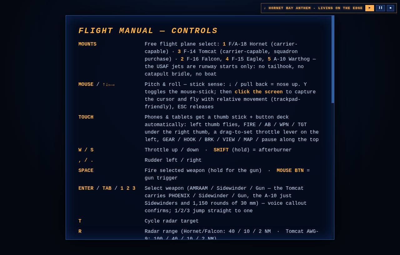
- Flight manual. The controls grid goes from 13 to 16 pixels with a wider key column, so the bind and what it does are both readable without squinting. Every key, every mount, every camera trick.
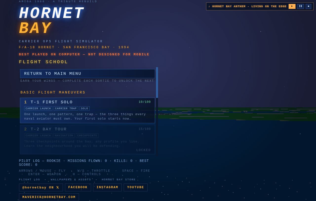
The list boards still scroll when they run long — the RETURN button stays pinned to the top, as always — but what’s on the glass now reads the way the Amiga original played on a living-room TV: big, bright, and impossible to misread. — HB