The briefing room learns to read the room: mission text sized to fit, and to be read d570d06
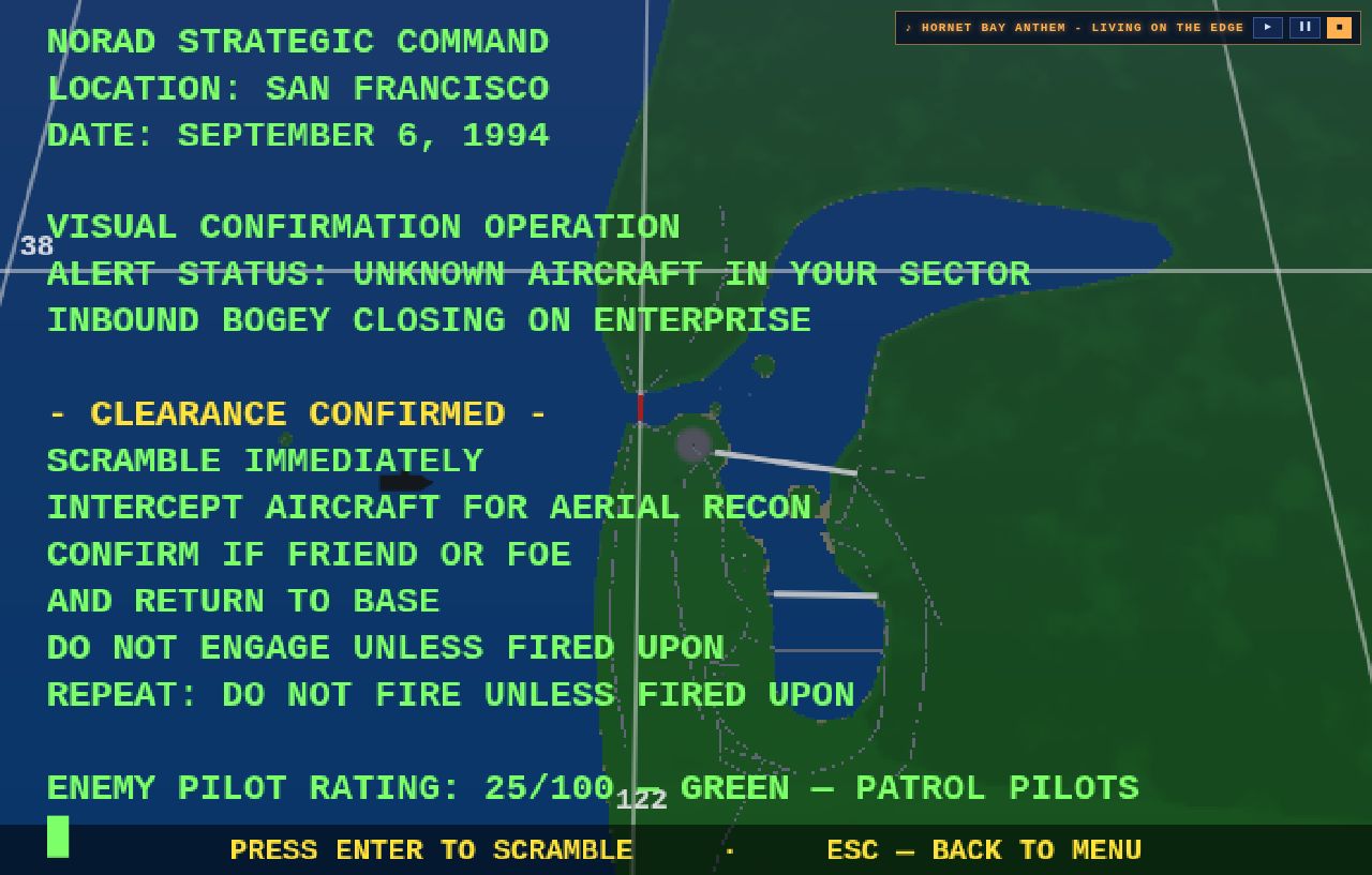
The mission briefing is the last thing you read before the catapult fires — and it was set in fixed 15-pixel type on a canvas the browser then stretches to fill the screen. On a desktop monitor that was genuinely hard to read, and the complaint was justified.
The type now sizes itself to the window and the length of the brief. Short briefs — the early training hops — read large; the marathon twenty-five-line strike packages shrink just enough to fit, and nothing ever renders smaller than the old fixed size. At a common desktop resolution the Mission 1 brief is up by a third; short briefs on a big monitor gain over half.
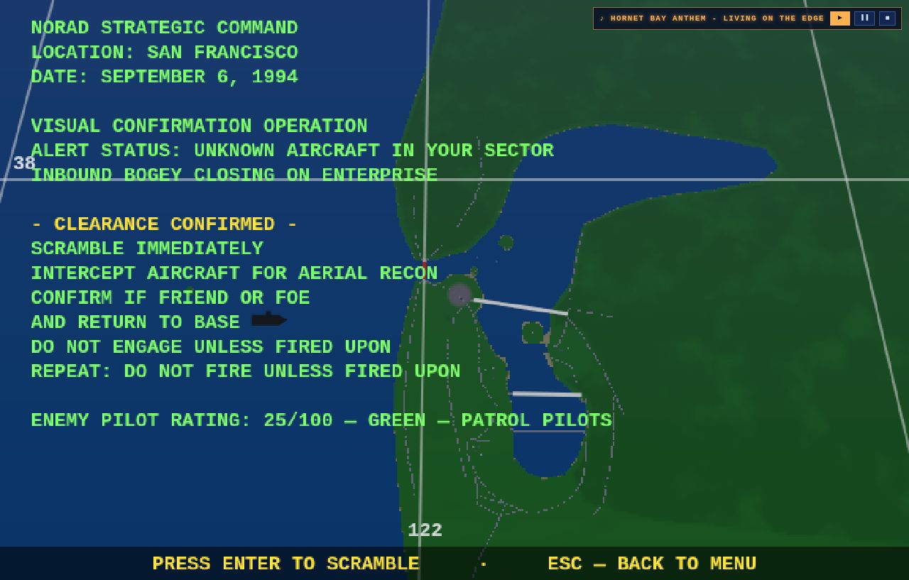
The Amiga original kept its briefs terse enough that one size fit all. Hornet Bay’s longest run to twenty-five lines of waypoints, tankers and radio calls — the type now works for the brief instead of against it. Eyes on the text, then eyes on the sky.